Chapter 4 Bias in the algorithm
In order to test whether COMPAS scores do an accurate job of deciding whether an offender is Low, Medium or High risk, we ran a Cox Proportional Hazards model. Northpointe, the company that created COMPAS and markets it to Law Enforcement, also ran a Cox model in their validation study.
We used the counting model and removed people when they were incarcerated. Due to errors in the underlying jail data, we need to filter out 32 rows that have an end date more than the start date. Considering that there are 13,334 total rows in the data, such a small amount of errors will not affect the results.
4.1 Setup
## Loading required package: pacmanpacman::p_load(
tidyverse, # tidyverse packages
conflicted, # an alternative conflict resolution strategy
ggthemes, # other themes for ggplot2
patchwork, # arranging ggplots
scales, # rescaling
survival, # survival analysis
broom, # for modeling
here, # reproducibility
glue, # pasting strings and objects
reticulate # source python codes
)
# To avoid conflicts
conflict_prefer("filter", "dplyr") ## [conflicted] Will prefer dplyr::filter over any other package## [conflicted] Will prefer dplyr::select over any other package4.2 Load data
## Warning: Duplicated column names deduplicated: 'decile_score' =>
## 'decile_score_1' [40], 'priors_count' => 'priors_count_1' [49]
##
## ── Column specification ────────────────────────────────────────────────────────────────────────────
## cols(
## .default = col_character(),
## id = col_double(),
## compas_screening_date = col_date(format = ""),
## dob = col_date(format = ""),
## age = col_double(),
## juv_fel_count = col_double(),
## decile_score = col_double(),
## juv_misd_count = col_double(),
## juv_other_count = col_double(),
## priors_count = col_double(),
## days_b_screening_arrest = col_double(),
## c_jail_in = col_datetime(format = ""),
## c_jail_out = col_datetime(format = ""),
## c_offense_date = col_date(format = ""),
## c_arrest_date = col_date(format = ""),
## c_days_from_compas = col_double(),
## is_recid = col_double(),
## r_days_from_arrest = col_double(),
## r_offense_date = col_date(format = ""),
## r_jail_in = col_date(format = ""),
## r_jail_out = col_date(format = "")
## # ... with 13 more columns
## )
## ℹ Use `spec()` for the full column specifications.## N of observations (rows): 13419
## N of variables (columns): 524.3 Wrangling
df <- cox_data %>%
    filter(score_text != "N/A") %>%
    filter(end > start) %>%
    mutate(c_charge_degree = factor(c_charge_degree),
           age_cat = factor(age_cat),
           race = factor(race, levels = c("Caucasian","African-American","Hispanic","Other","Asian","Native American")),
           sex = factor(sex, levels = c("Male","Female")),
           score_factor = factor(score_text, levels = c("Low", "Medium", "High")))

grp <- df[!duplicated(df$id),]
4.3.1 Descriptive analysis
Score distribution
grp %>%
    group_by(score_factor) %>%
      count() %>%
      ggplot(aes(x = score_factor, y = n)) +
        geom_col() +
        labs(x = "Score",
             y = "Count",
             title = "Score distribution")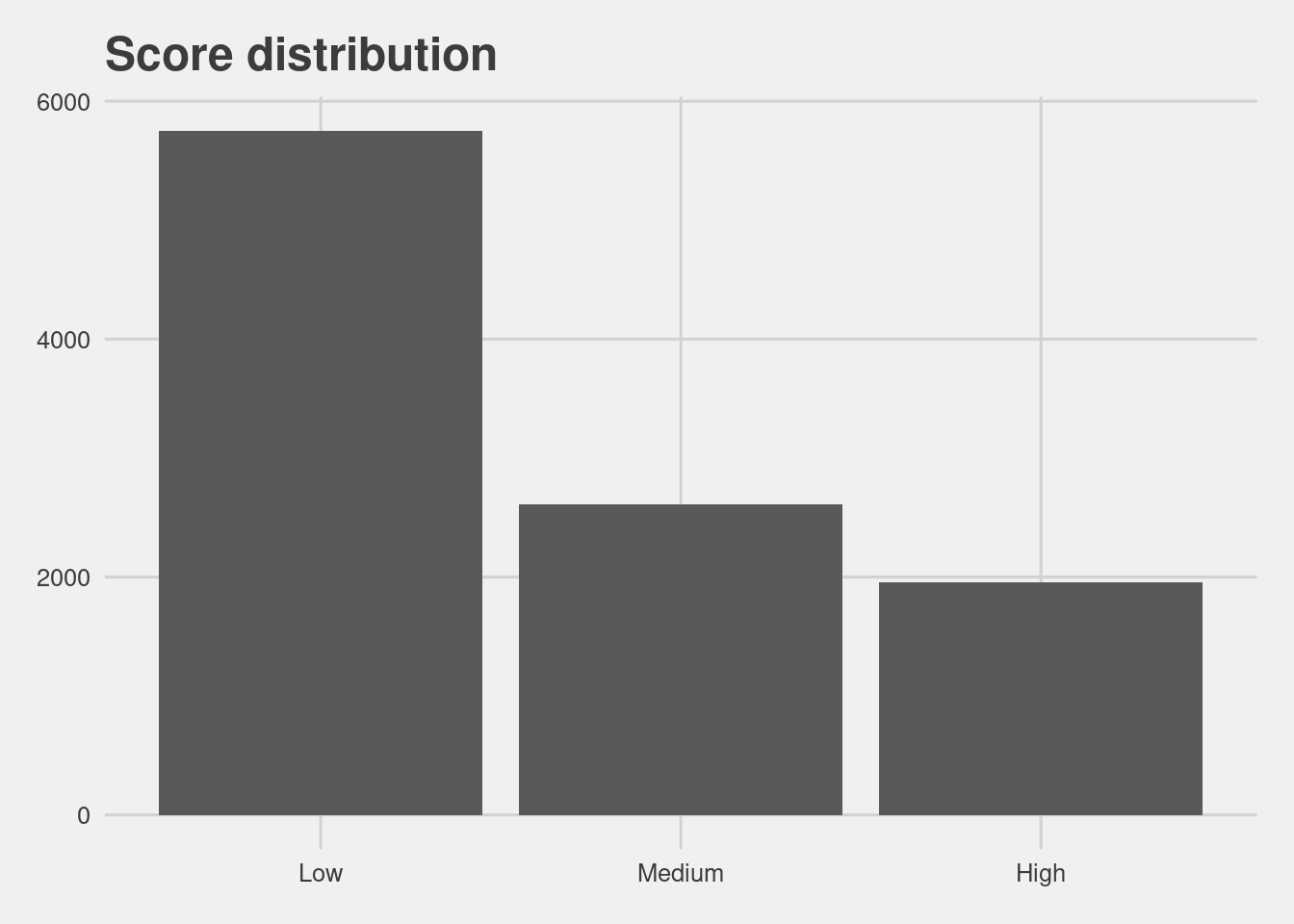
Score distribution by race
df %>%
  ggplot(aes(ordered(score_factor))) +
          geom_bar() +
          facet_wrap(~race, nrow = 2) +
          labs(x = "Decile Score",
               y = "Count",
               Title = "Defendant's Decile Score")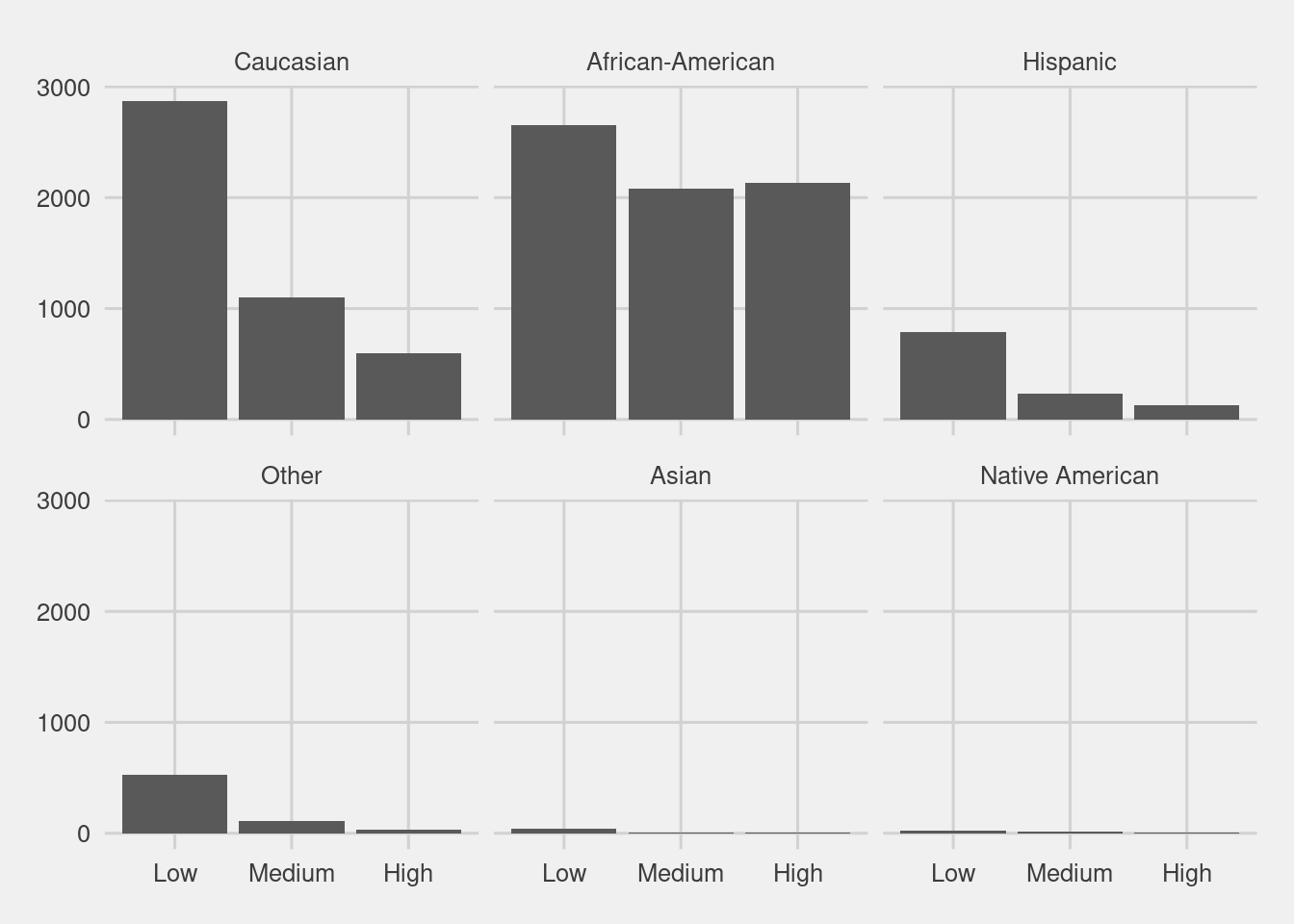
4.4 Modeling
f2 <- Surv(start, end, event, type="counting") ~ race + score_factor + race * score_factor

model <- coxph(f2, data = df)

model %>%
  broom::tidy(conf.int = TRUE) %>%
  mutate(term = gsub("race|score_factor","", term)) %>%
  filter(term != "<chr>") %>%
  ggplot(aes(x = fct_reorder(term, estimate), y = estimate, ymax = conf.high, ymin = conf.low)) +
  geom_pointrange() +
  coord_flip() +
  labs(y = "Estimate", x = "")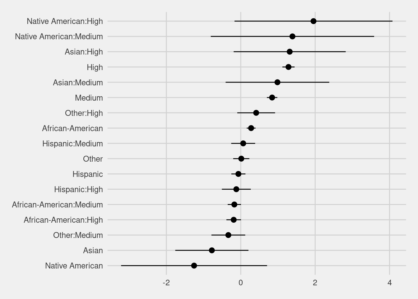
The interaction term shows a similar disparity as the logistic regression above.
High risk white defendants are 3.61 more likely than low risk white defendants, while High risk black defendants are 2.99 more likely than low.
visualize_surv <- function(input){

f <- Surv(start, end, event, type="counting") ~ score_factor

fit <- survfit(f, data = input)

fit %>%
    tidy(conf.int = TRUE) %>%
    mutate(strata = gsub("score_factor=","", strata)) %>%
    mutate(strata = factor(strata, levels = c("High","Medium","Low"))) %>%
    ggplot(aes(x = time, y = estimate, ymax = conf.high, ymin = conf.low, group = strata, col = strata)) +
    geom_pointrange(alpha = 0.1) +
    guides(colour = guide_legend(override.aes = list(alpha = 1))) +
    ylim(c(0, 1)) +
    labs(x = "Time", y = "Estimated survival rate", col = "Strata")}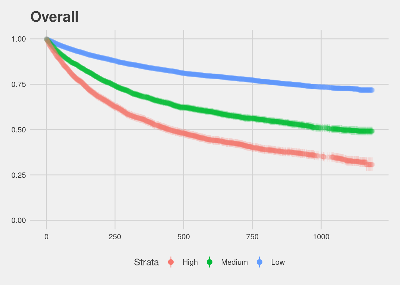
Black defendants do recidivate at higher rates according to race specific Kaplan Meier plots.
(df %>% filter(race == "Caucasian") %>% visualize_surv() + ggtitle("Caucasian")) /
(df %>% filter(race == "African-American") %>% visualize_surv() + ggtitle("African-American")) 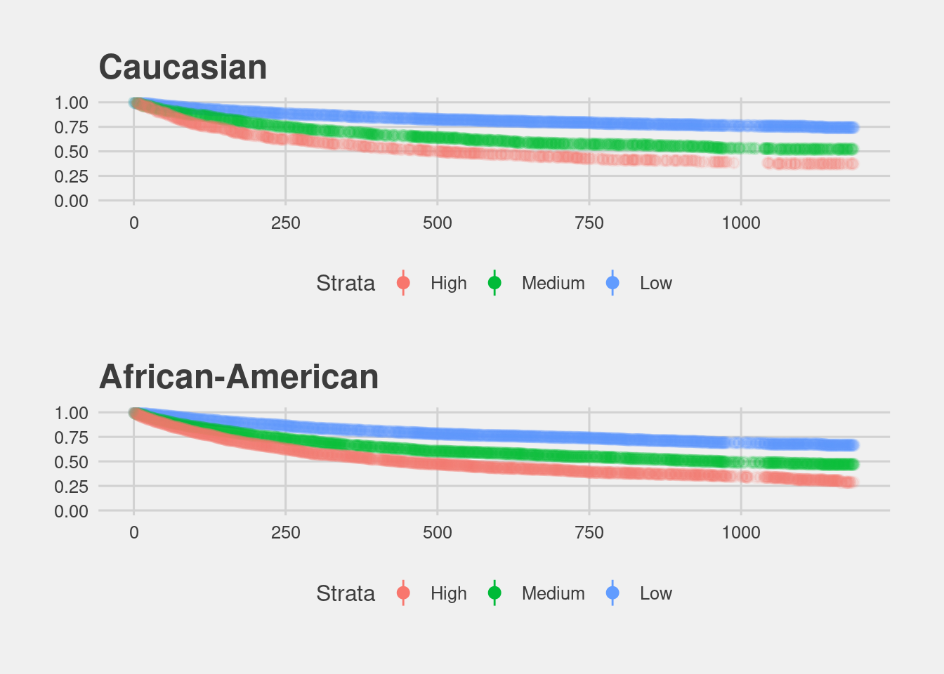
In terms of underlying recidivism rates, we can look at gender specific Kaplan Meier estimates. There is a striking difference between women and men.
(df %>% filter(sex == "Female") %>% visualize_surv() + ggtitle("Female")) /

(df %>% filter(sex == "Male") %>% visualize_surv() + ggtitle("Male"))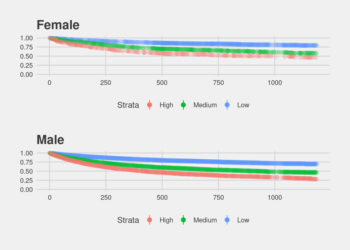
As these plots show, the COMPAS score treats a High risk women the same as a Medium risk man.
4.4.1 Risk of Recidivism accuracy
The above analysis shows that the COMPAS algorithm does overpredict African-American defendant’s future recidivism, but we haven’t yet explored the direction of the bias. We can discover fine differences in overprediction and underprediction by comparing COMPAS scores across racial lines.
## [1] "/home/jae/.local/share/r-miniconda/envs/r-reticulate/bin/python"# install libs
conda_install("r-reticulate", c("pandas"))
# indicate that we want to use a specific condaenv
use_condaenv("r-reticulate")
from truth_tables import PeekyReader, Person, table, is_race, count, vtable, hightable, vhightable
from csv import DictReader

people = []
with open("./data/cox-parsed.csv") as f:
    reader = PeekyReader(DictReader(f))
    try:
        while True:
            p = Person(reader)
            if p.valid:
                people.append(p)
    except StopIteration:
        pass
pop = list(filter(lambda i: ((i.recidivist == True and i.lifetime <= 730) or
                              i.lifetime > 730), list(filter(lambda x: x.score_valid, people))))

recid = list(filter(lambda i: i.recidivist == True and i.lifetime <= 730, pop))

rset = set(recid)

surv = [i for i in pop if i not in rset]
Define a function for a table.
import pandas as pd

def create_table(x, y):

  t = table(list(x), list(y))

  df = pd.DataFrame(t.items(),
             columns = ['Metrics', 'Scores'])

  return(df)
- All defenders
read.csv(here("data", "table_recid.csv"))[,-1] %>%
  ggplot(aes(x = Metrics, y = Scores)) +
  geom_col() +
  labs(title = "Recidivism")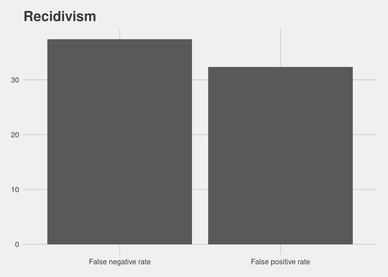
That number is higher for African Americans at 44.85% and lower for whites at 23.45%.
def create_comp_tables(recid_data, surv_data):

    # filtering variables
    is_afam = is_race("African-American")
    is_white = is_race("Caucasian")

    # dfs
    df1 = create_table(filter(is_afam, recid_data),
                       filter(is_afam, surv_data))

    df2 = create_table(filter(is_white, recid_data),
                       filter(is_white, surv_data))

    # concat
    dfs = pd.concat([df1, df2])

    dfs['Group'] = ['African Americans','African Americans','Whites','Whites']

    return(dfs)
read.csv(here("data", "comp_tables_recid.csv"))[,-1] %>%
  ggplot(aes(x = Metrics, y = Scores, fill = Group)) +
  geom_col(position = "dodge") +
  coord_flip() +
  labs(title = "Recidivism")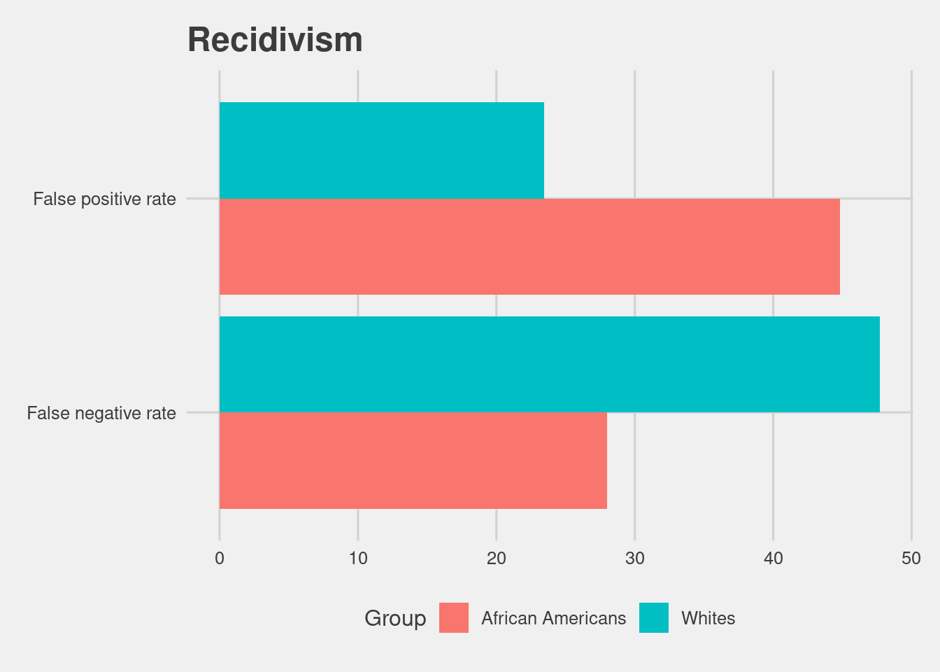
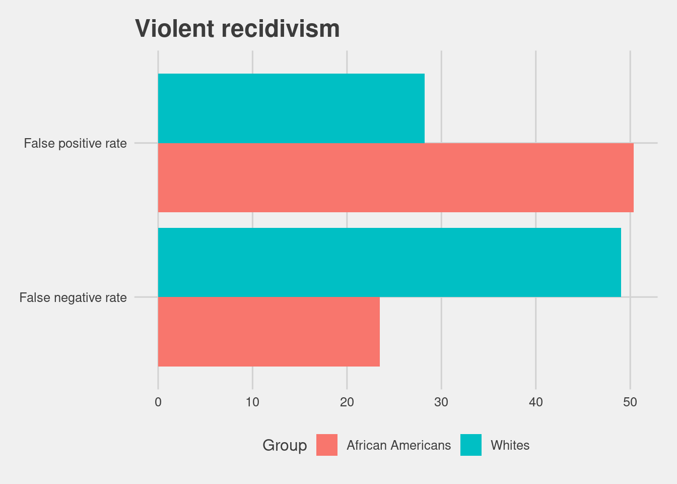
4.4.2 Risk of Violent Recidivism accuracy
COMPAS also offers a score that aims to measure a persons risk of violent recidivism, which has a similar overall accuracy to the Recidivism score.
vpeople = []

with open("./data/cox-violent-parsed.csv") as f:
    reader = PeekyReader(DictReader(f))
    try:
        while True:
            p = Person(reader)
            if p.valid:
                vpeople.append(p)
    except StopIteration:
        pass

vpop = list(filter(lambda i: ((i.violent_recidivist == True and i.lifetime <= 730) or
                              i.lifetime > 730), list(filter(lambda x: x.vscore_valid, vpeople))))

vrecid = list(filter(lambda i: i.violent_recidivist == True and i.lifetime <= 730, vpeople))

vrset = set(vrecid)

vsurv = [i for i in vpop if i not in vrset]read.csv(here("data", "table_vrecid.csv"))[,-1] %>%
ggplot(aes(x = Metrics, y = Scores)) +
geom_col() +
labs(title = "Violent recidivism")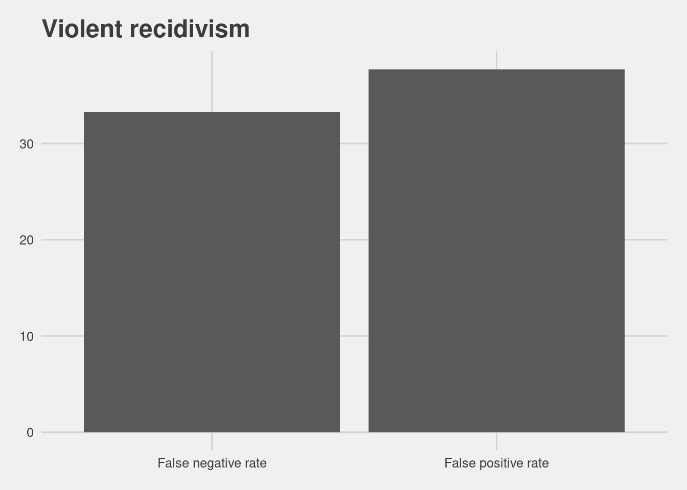
Even more so for Black defendants.
read.csv(here("data", "comp_tables_vrecid.csv"))[,-1] %>%
  ggplot(aes(x = Metrics, y = Scores, fill = Group)) +
  geom_col(position = "dodge") +
  coord_flip() +
  labs(title = "Violent recidivism")